It’s been quite a busy week all over since Apple‘s flagship iPhone 13 and iPhone 13 Pro smartphone lineup were launched. Reviews and impressions are pouring in from all over the tech space about how good the non-pro-iPhone 13 model is and its balanced approach to things overall.
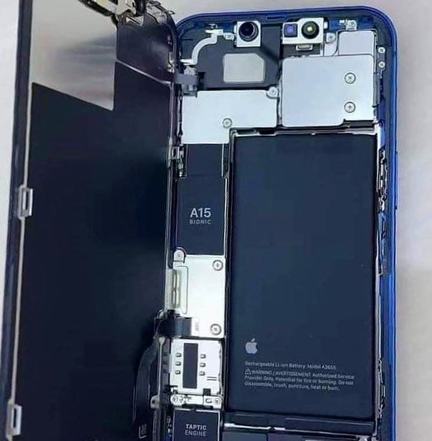
Speaking of which, a photo from @1nsane_dev is doing the rounds on Twitter showcasing the rearranged guts of the iPhone 13 in full glory.
Apple at the California streaming event reasoned the switch to a diagonal camera layout for the iPhone 13 line to be the improved sensor-shift stabilized camera sensors requiring the internals to be rearranged. As you can see, things have been organized much better this time making the interior of the phone look cleaner and nicer compared to the iPhone 12.
RELATED: iPhone 13 lineup brings improved battery capacities
 Source: @1nsane_dev on Twitter
Things have been neatly and smartly arranged to accommodate the larger battery and upgraded camera system. Towards the right, we have the new large battery with the motherboard to the left and the also notice the A15 Bionic chipset here. The smaller Face ID module sits at the top with all of the flex cables shielded out below the same. The great Tapric Engine also got a size reduction as well.
And yes, nobody really cares about how the innards of a phone look like but Apple has gone the extra mile as usual with immaculate attention to detail and that is nothing short of impressive.
